Matplotlib is Python’s most used library for scientific visualization. However, there are many ways to use it, and its syntax can be a little misleading. This post tries to be a more formal than the example-based tutorials out there without giving up on some examples. I am doing this as a reference to myself, to be honest.
First thing you have to remember is that there are two ways of using Matplotlib, the global way and the local, object oriented one. The latter is more readable and flexible, while the former is quicker to write.
With the global approach, you are always working with one implicit figure. Every time you order the library to draw something, it will do it in this elusive entity. In the local approach, you will create Figure objects and explicitely say you want to draw things in it. I will be focusing on the figure approach.
Figures are the top-level container for drawings. They have a specific size (in inches). Inside them lie Axes (not axis!) objects. An Axes object is a region on a Figure, and it is in it that the actual plotting of graphs happens. You can have many Axes in a Figure, even if they overlap. Think of them as zones, really.
An empty Figure is not even white. It is not even transparent. If you want a small rectangle around it, you have to create an Axes, and then draw it. If you want to plot a one variable function, you would have to plot every one of its points, and then connect neighbors by small lines. Luckily, there is the plot function, which is perfect for most of our functional needs. You give it your x (inputs) and your f(x) (outputs). It creates a figure with an Axes in it. It this Axes, it draws everything we need: x ticks, y ticks, a rectangle around it and, of course, the points connected by lines we know and love.
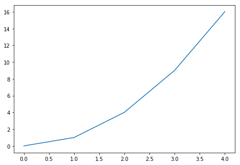
This first code example shows the relationship between Figure and Axes.
import matplotlib.pyplot as plt


fig = plt.figure()
ax = fig.add_axes([0., 0., 1., 1., ]) # define a rectangle
							# It goes from 0 to 1 (100%)
							# from top to bottom and from
							# left to right.
X = [0,1,2,3,4]
Fx = [x**2 for x in X]
ax.plot(X,Fx) # plots happen inside Axes objects

plt.show(fig)
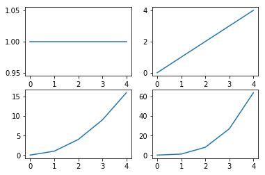
Even though we can dispose the Axes how we want inside the figure, we usually do the same configuration over and over, creating equal-sized, equally-spaced rectangular Axes. So there is a shorthand to create a Figure with this kind of display: the subplots function. This one creates a Figure with a set of Axes disposed in a rectangular fashion inside. You dictate the fashion: The first argument dictates how many lines the grid will have, the second the number of columns. The subplot will give you a figure and a matrix of Axes. You access each Axes by its row and column, and fill it with plots, for instance. Let’s create a 2x2 subplot, and fill it with different functions:
import matplotlib.pyplot as plt
fig,axes = plt.subplots(2,2)

# Create something for the y axis
F0 = [x**0 for x in X]
F1 = [x**1 for x in X]
F2 = [x**2 for x in X]
F3 = [x**3 for x in X]


axes[0,0].plot(X,F0)
axes[0,1].plot(X,F1)
axes[1,0].plot(X,F2)
axes[1,1].plot(X,F3)

plt.show(fig)
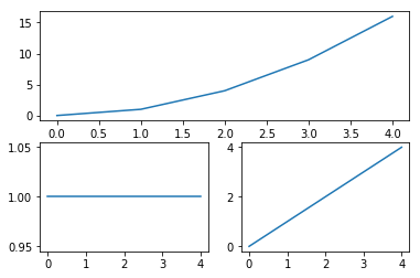
Another useful way to create grids of plots is by creating a figure and then adding subplots to it with the add_subplotadd_subplot function. With add subplots, you specify the grid structure you are imagining in your mind, and he will return you an Axes with these dimensions. This function takes 3 parameters: the number of rows you are imagining, the number of columns, and the number of the section of the grid you want to access. So, for example, if you want a 2x2 grid and you want the bottom left square, you should do a add_subplot(2,2,3)add_subplot(2,2,3) (it counts by row, then by column).
This way is better suited for making irregular grid. For example, suppose we want a graph to fill half the Figure and other two to fill the bottom. We would do:
import matplotlib.pyplot as plt

fig = plt.figure()

ax12 = fig.add_subplot(2,1,1) # This one fills
                            # the top half of the picture

ax3 = fig.add_subplot(2,2,3) # These ones fill half of the
ax4 = fig.add_subplot(2,2,4) # space left each.

ax12.plot(X,Fx)
ax3.plot(X,F0)
ax4.plot(X,F1)

plt.show(fig)
Check these two posts for more detailed information: